
GAFA – UX Design Case Study
ABOUT GAFA
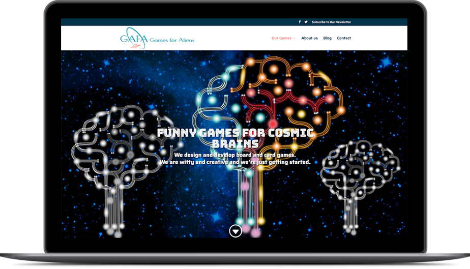
GAFA – designs and develops unique games (board games, card games, and video games) based on real-life experiences and published books, that could change gamers’ life, perceptions, and views for better. The stakeholders want to offer unique and provocative content for the responsive website, with dedicated landing pages for their designed tabletop games. They also want to create games that are fun. Games that players can enjoy, revisit often and lose themselves in while learning new things.
TASK
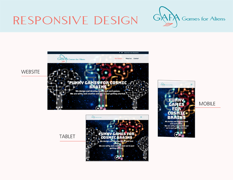
The task was to build brand awareness and brand trust by creating a fully responsive website that would reflect the brand mission and attract the seasoned adult gamers on the website to purchase GAFA’s products.
MY ROLE
I was responsible for being hands-on with the process of research and building a strategy – collect insights, how users engage with the website, synthesize those insights – and providing sketches, user flows, user personas, the journey map, sitemaps, and wireframes.
RESEARCH AND STRATEGY
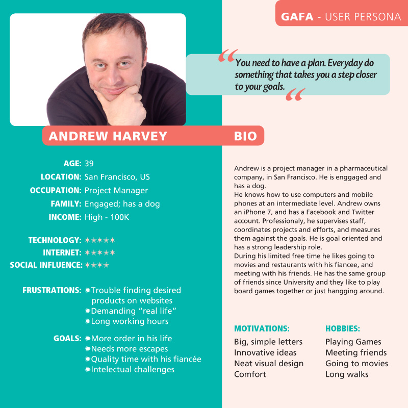
USER PERSONA
In order to create the User Personas, I observed and studied the community built around games-centered websites and forums. I also visited three games cafes several times, playing games with the veteran gamers, talking to them in informal meetings, and conducting direct interviews with managers of the cafes. Based on all the data I gathered in this time I created a User Persona that matches the clear demographic segment of seasoned gamers (online and in the cafes).
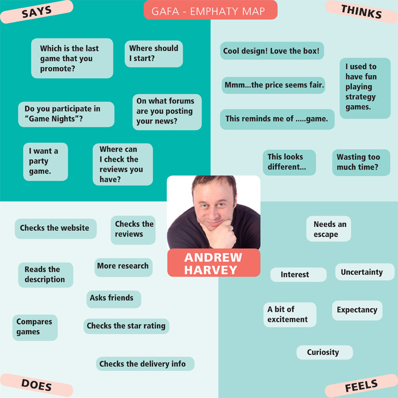
USER EMPATHY MAP
During the personal interviews with the gamers and the stakeholders, I managed to track in a collaborative effort with GAFA team, the mental route the gamers usually go through from looking for or discovering new games, reading reviews or other people’s opinions, to what their feelings and emotions are when going through the entire process up to taking action. I succeeded in mapping their behavior from discovery to what they think and feel, to identifying needs and insights.
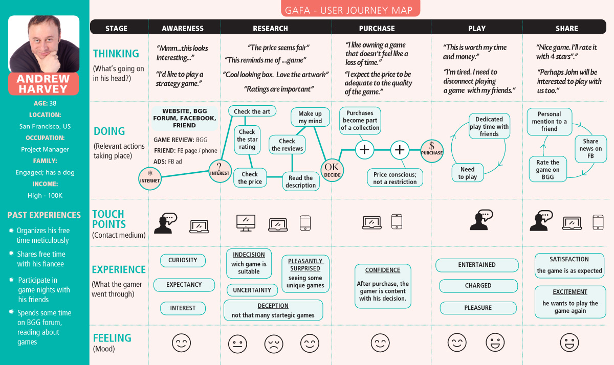
USER JOURNEY MAP
During my informal discussions with the seasoned gamers in the cafe, I succeeded in mapping the typical gamer’s journey from the moment a new game appears on the market, through their habits in testing and reading about the game, considering its worth, to creating the need for that specific game and taking the decision of buying it and adding it to their collection. And their first steps after purchasing a new game – playing it with their friends, talking about it, and eventually recommending it.
Following my research, I illustrated a Journey Map and all the touch points that gamers come into contact with GAFA online or offline.
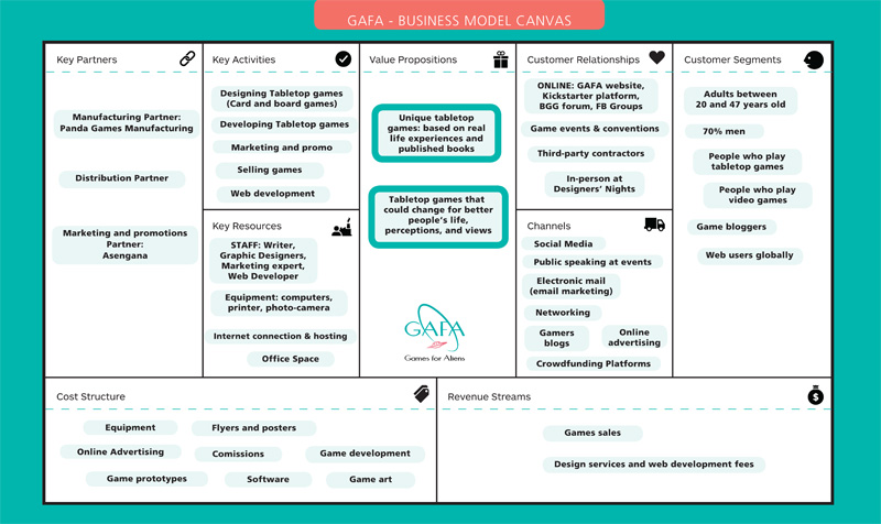
BUSINESS MODEL CANVAS
GAFA is a start-up company that works towards creating its viable business model. Looking at the competition and taking into account the real challenges of creating new games, developing them, producing them, and eventually shipping them and distributing them to the customers and points of purchase, we build what it is a present business model for GAFA. As the company evolves there will probably be some changes, but the skeleton of the business is the one I compiled in this Business Model Canvas.
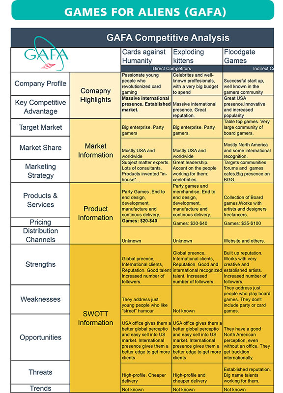
COMPETITIVE BUSINESS ANALYSIS
These days there are a lot of companies in the tabletop games industry. But for my competitive business analysis, I chose as direct competitors two of the most successful enterprises that started their business with a card game, same as GAFA: Cards Against Humanity and Exploding Kittens. As an indirect competitor, I chose to analyze Floodgate Games, which is a successful business but focuses on board games rather than card games.
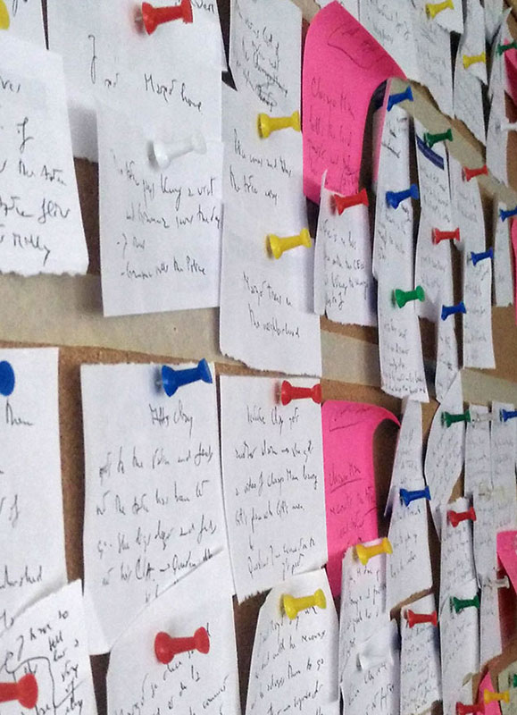
CARD SORTING
At GAFA, the team met a few times both online and in person to discuss research topics of interest. Afterward, I collected and noted the highlights of the conversations. Therefore, I prepared the deck of cards with concepts on them. GAFA used as a UX research method a hybrid card sorting technique. It began as a closed card sort but allowed participants to create categories that were missing from the card deck. So, the participants grouped individual labels written on note cards, according to the already established criteria but also suggesting criteria that made sense to them.
INFORMATION ARCHITECTURE
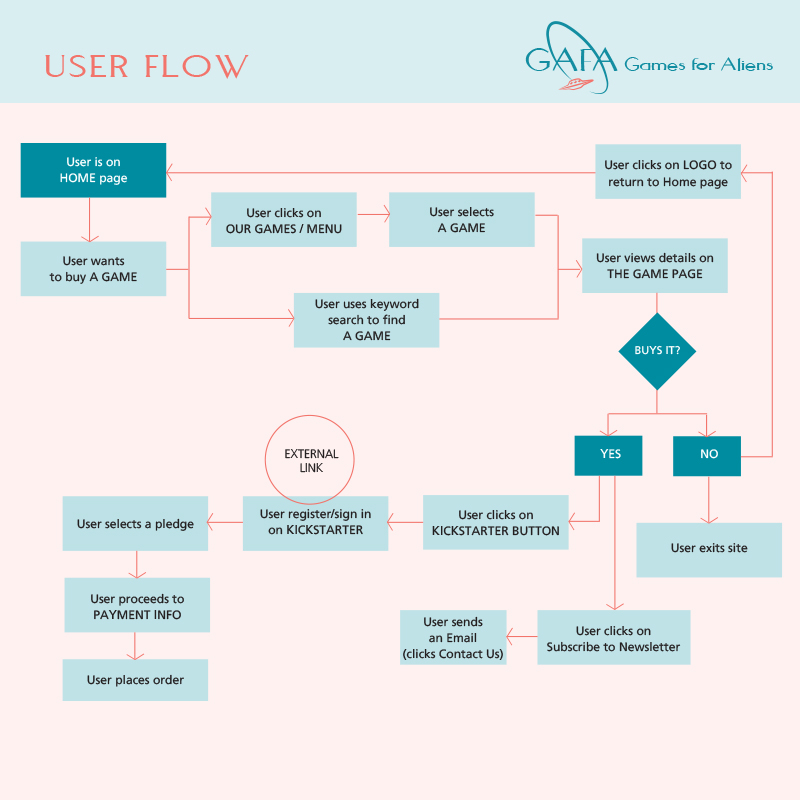
USER FLOW
For GAFA, I created the visual representation of the user’s path to complete a task within the digital product (the website). It is a view from the users perspective of the site organization, making it easier to identify which steps work and which could be improved or redesigned.
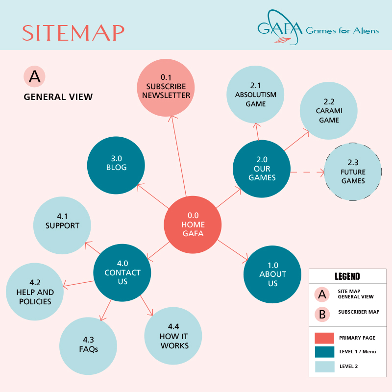
SITEMAP
The sitemap I designed helps visually denote how different pages and content relate to one another. As a key person responsible for determining how information on the website is displayed and accessed, I had to create a hierarchy of content and the navigation showing how the user moves through it.
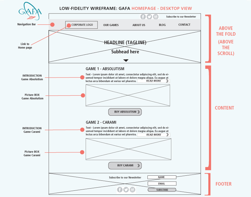
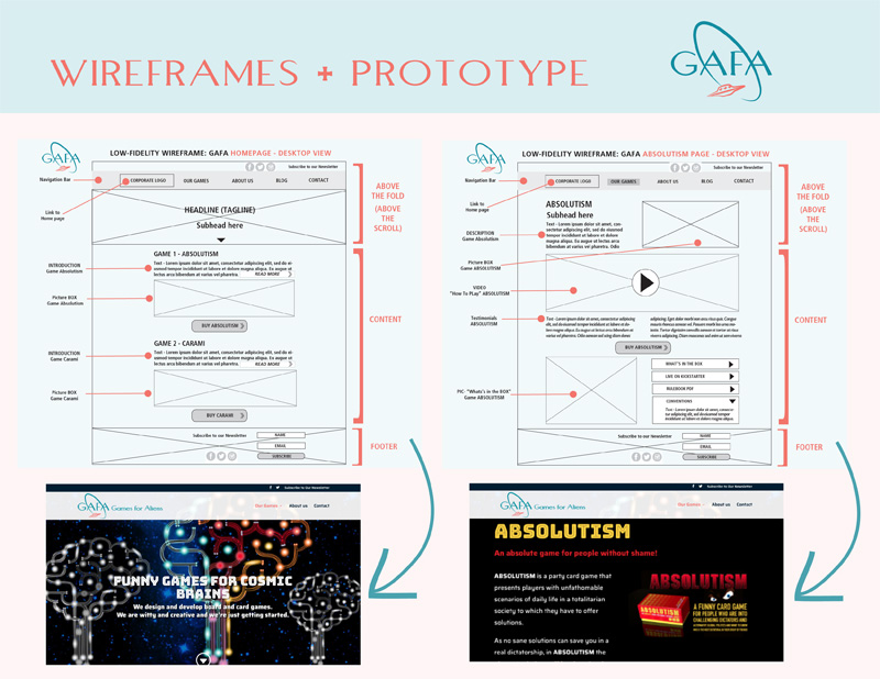
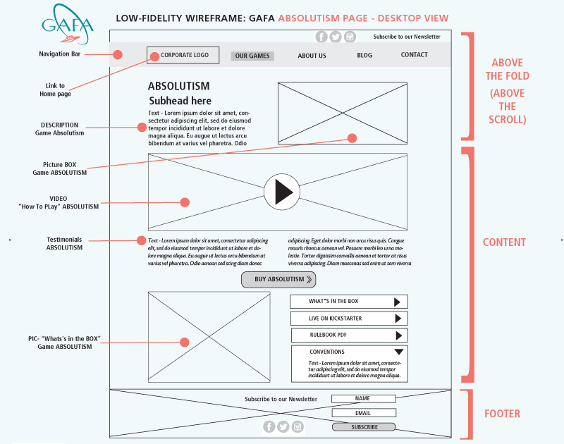
WIREFRAMES
Through these wireframes, I demonstrated to the stakeholders the hierarchy of information and also what content on a page is supposed to be there, and how it will be arranged. The first wireframe shows the home page, while the second wireframe shows the landing page for one of the games (product).
Let’s Start Something new Say Hello!
If you have any questions, comments, feedback, or you’d just like to reach out, please don’t hesitate to get in touch. I’d love to hear from you.