ASENGANA – Case Study
ABOUT ASENGANA
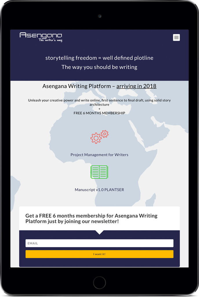
ASENGANA is an online writing platform offering writers tools to world build, create characters, develop plotlines and every other aspect of writing stories. It offers a whole new experience in story writing. Asengana platform is being built on an extensive user experience research. Its aim is to accommodate all the writer’s needs during the writing process. Asengana is specifically designed for a singular type of user: the writer. It’s an efficient writing software with a friendly user interface – Manuscript v1.0 PLANTSER. ASENGANA tries to attract new and established writers on its platform to buy a membership and to use its writing project management tools by offering a friendly user interface, easy to download tools, and real insight analytics into their work. Visit site.
TASK
The task was to build a blueprint for the online platform. From who it addresses, how it interacts with the clients, what services and products it offers, and what is the structure of these services as to serve this particular type of clients, to the other end of what kind of environment such clients desire, and what other services can it offer after the client finishes using the specific software made available by Asengana.
MY ROLE
I was responsible for being hands-on with the process of research and building a strategy – collect insights, how users engage with the platform, synthesize those insights – and providing sketches, user flows, user personas, the journey map, sitemaps, and wireframes. I am now working on a prototype together with the developer to help him in developing the software that will operate the online platform.
RESEARCH AND STRATEGY
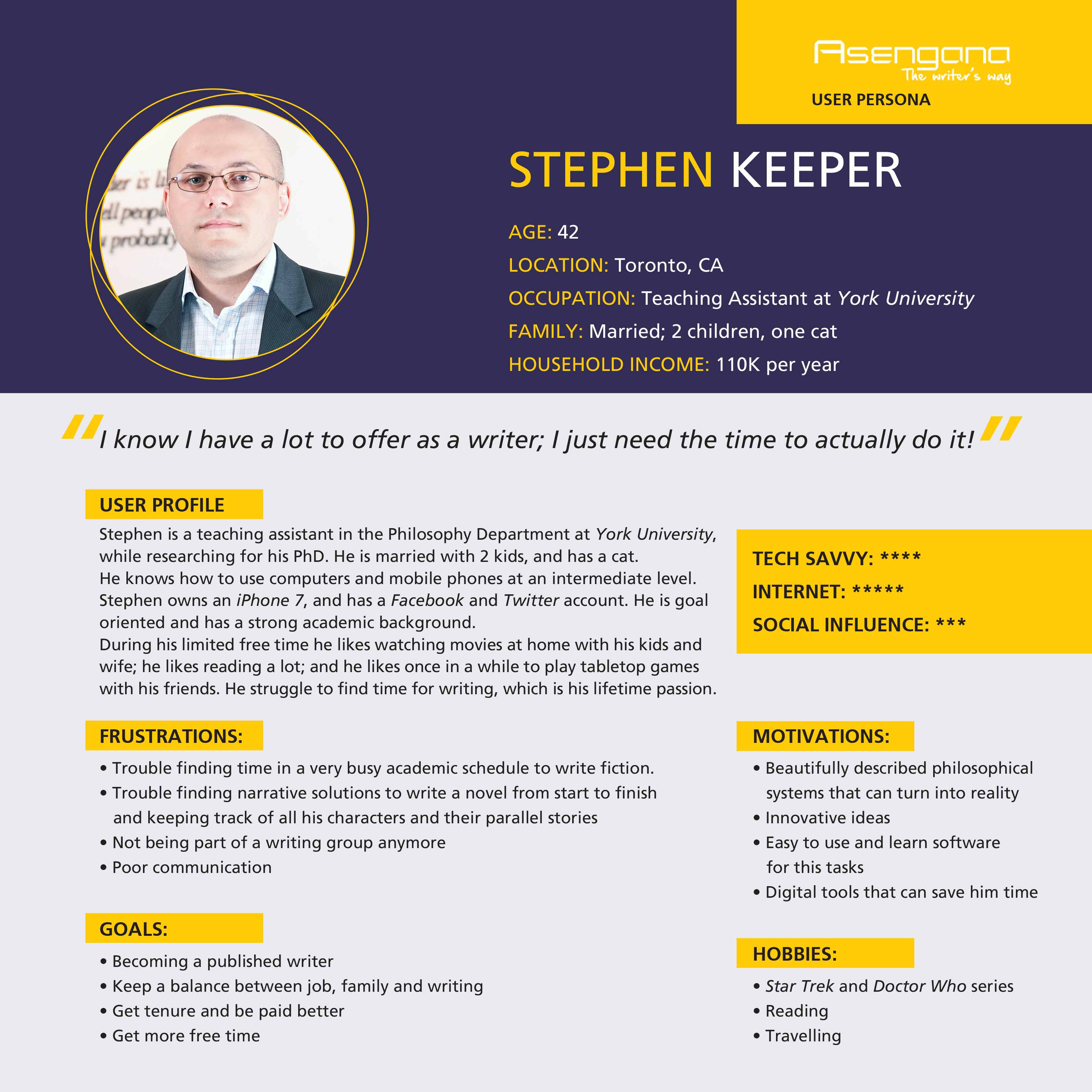
USER PERSONA
For the purpose of creating User Personas, I spent the time to study the community built around writing-centered websites and forums, as well as live events, like conventions and book fairs. I participated in several such events, attending panels held by professional writers, but also by beginning writers, thus having the opportunity to address special issues regarding their writing activity. Based on all the data I gathered in this time I created a User Persona that matches the clear demographic segment of writers (online and at events).
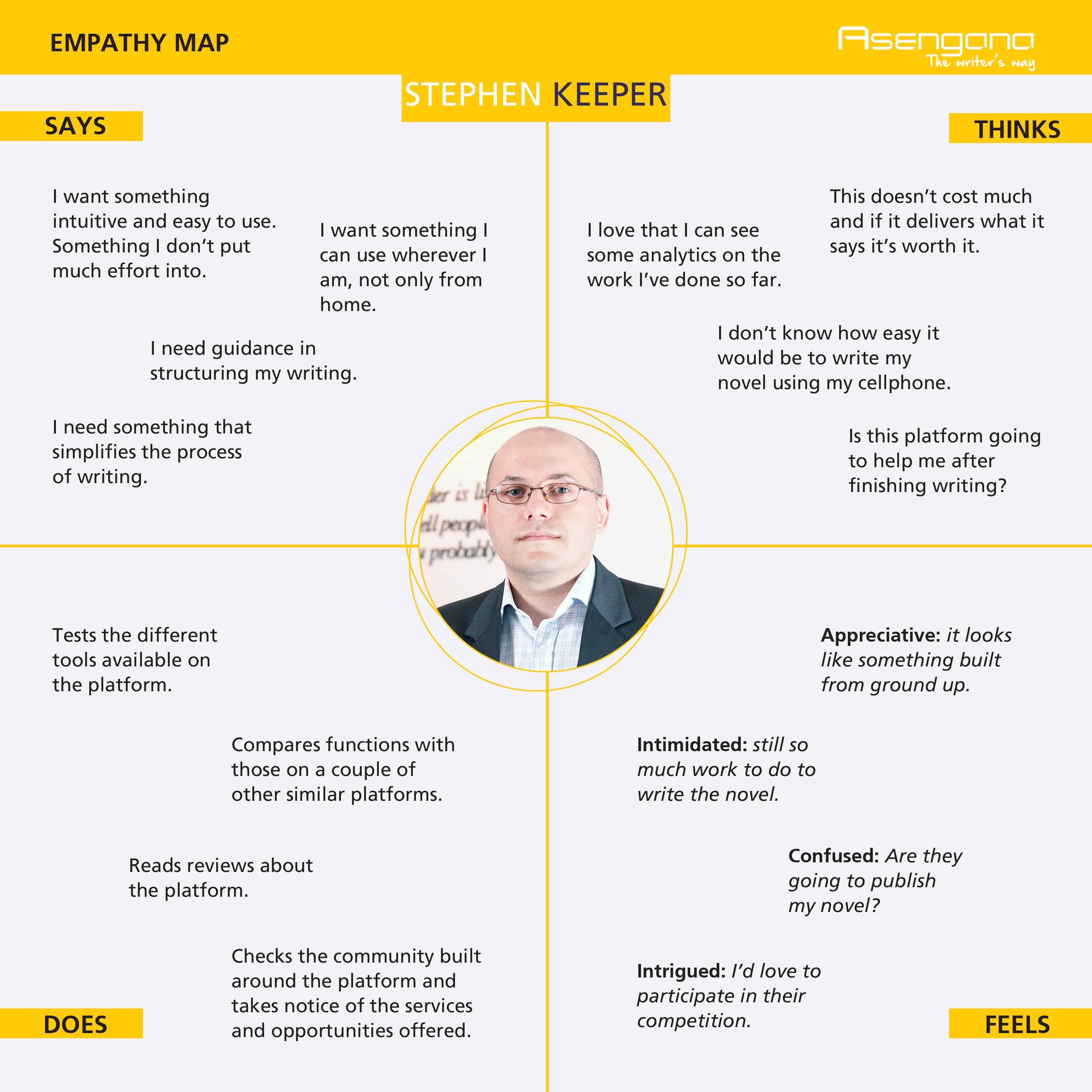
USER EMPATHY MAP
During the questions and answers at the panels with the writers, I managed to track in a collaborative effort with ASENGANA team, the mental route writers usually go through from having an idea for a new story, researching the subject, structuring the possible story, working on the characters, to what their feelings and emotions are when going through the entire process up to starting writing. I succeeded in mapping their behavior from inception to what they think and feel, to identifying needs and insights into the creative process.
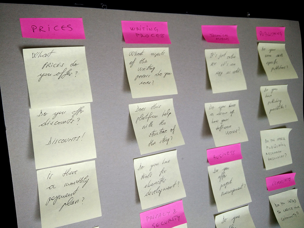
CARD SORTING
At ASENGANA, the team met a few times both online and in person to discuss research topics of interest. Afterward, I collected and noted the highlights of the conversations. Therefore, I prepared the deck of cards with concepts on them. ASENGANA used as a UX research method a hybrid card sorting technique. It began as a closed card sort but allowed participants to create categories that were missing from the card deck. So, the participants grouped individual labels written on note cards, according to the already established criteria but also suggesting criteria that made sense to them.
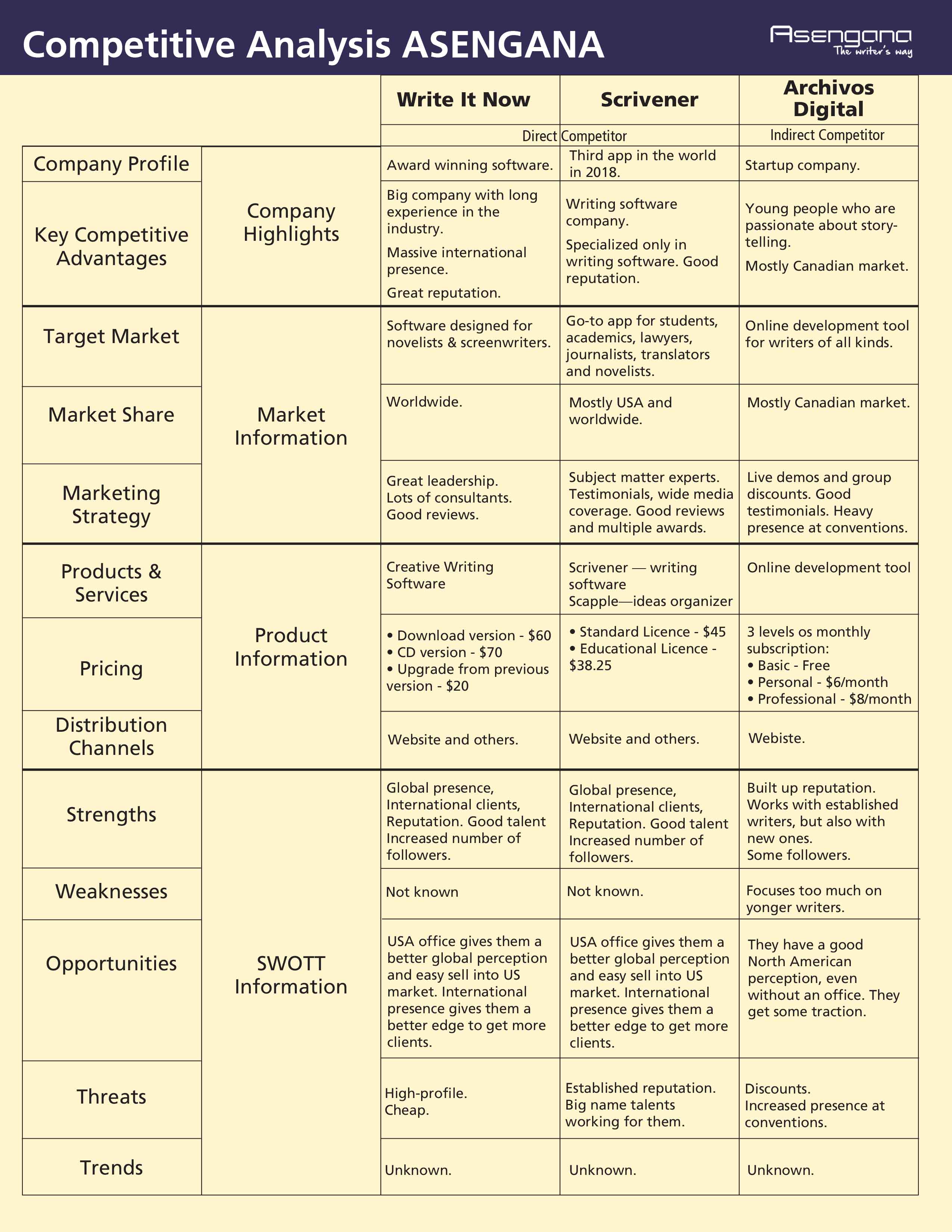
COMPETITIVE BUSINESS ANALYSIS
These days the number of enterprises trying to find a niche in the writing industry is growing. For my competitive business analysis, I chose as direct competitors two of the most successful companies that started their business with a software, similar to ASENGANA: Write It Now and Scrivener. As an indirect competitor, I chose to analyze Archivos Digital, which is a successful business but focuses on a very narrow slice of the writing business.
Asengana Project Management
SITE MAP
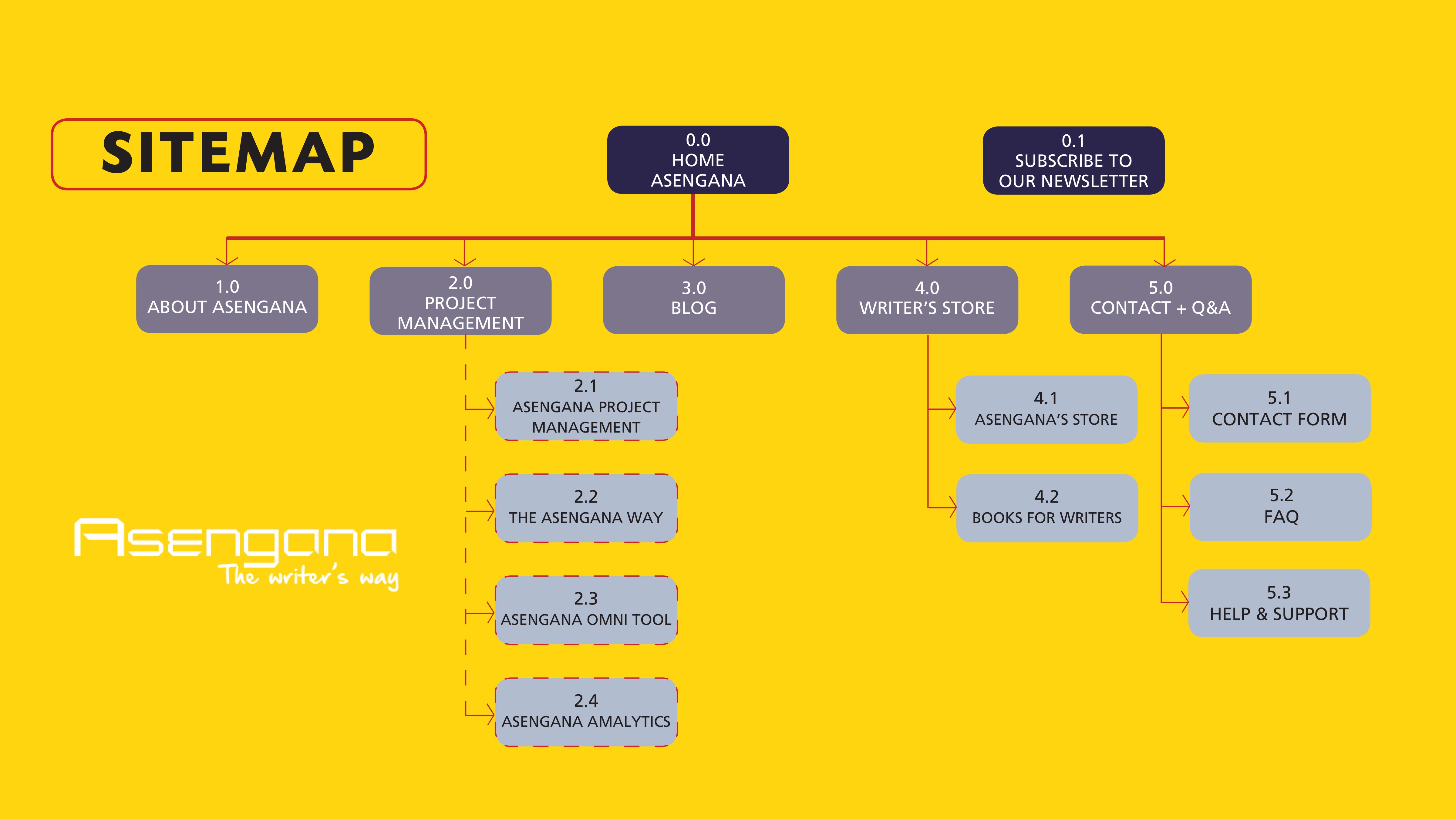
The sitemap I designed helps visually denote how different pages and content relate to one another. As a key person responsible for determining how information on the website is displayed and accessed, I had to create a hierarchy of content and the navigation showing how the user moves through it.
Let’s Start Something new Say Hello!
If you have any questions, comments, feedback, or you’d just like to reach out, please don’t hesitate to get in touch. I’d love to hear from you.
