ART FOR RENT – Case Study
ABOUT ART FOR RENT
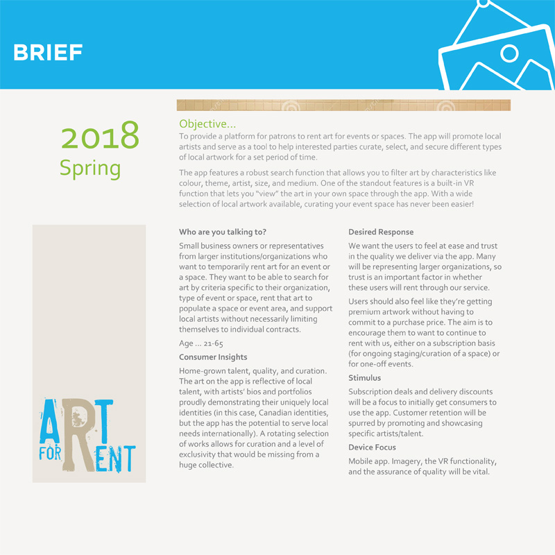
Art for Rent is a platform for patrons to rent art for events or spaces. The app will promote local artists and serve as a tool to help interested parties curate, select, and secure different types of local artwork for a set period of time. The patrons are small business owners or representatives from larger institutions/organizations who want to temporarily rent art for an event or space. They want to be able to search for art by criteria specific to their organization, type of event or space, rent that art to populate a space or event area and support local artists without necessarily limiting themselves to individual contracts. The artists are home-grown talent. The art on the app is reflective of local talent, with artists’ bios and portfolios proudly demonstrating their uniquely local identities.
TASK
The task was to provide a platform for patrons to rent art for events or spaces. The app will promote local artists and serve as a tool to help interested parties curate, select, and secure different types of local artwork for a set period of time. The app features a robust search function that allows you to filter art by characteristics like colour, theme, artist, size, and medium. One of the standout features is a built-in AR function that lets you “view” the art in your own space through the app.
MY ROLE
I lead the branding strategy, research, and design for this app that serves the art community. From designing the corporate identity, coordinating the research to wireframing, I helped shape the vision and execution of a seed-funded start-up that offers tools for local artists and their patrons.
BRIEF
There is a rich artist community in Ontario and the majority of them don’t have access to agents or venues where they can exhibit or sell their work. At the same time, there are a lot of small business owners or larger institutions who want to temporarily rent art for events or for a special space, instead of buying the art. This way they have a possibility to regularly change the artwork as well as decide if they want to keep any of it after the event is done. Art for Rent app fills the needs of those two communities, creating a digital environment where the patrons can meet the artists and their work, rent it for a fraction of the selling cost and eventually decide on a final decision of buying. At the same time, the artists receive an income for their art before selling it.
USER PERSONA
There are two User Personas that will use the app: the Artist and the Renter. I focused on the Renter as this is the person who will make it happen for the artists. I conducted interviews with several small business owners and I realized that there are two important aspects to be taken into account when designing the app-the users want to trust the app that it will deliver in time and on terms; and that Art for Rent will provide premium artwork at reasonable renting prices. The aim is to encourage them to continuously rent with us, thus supporting the artist community.
CARD SORTING
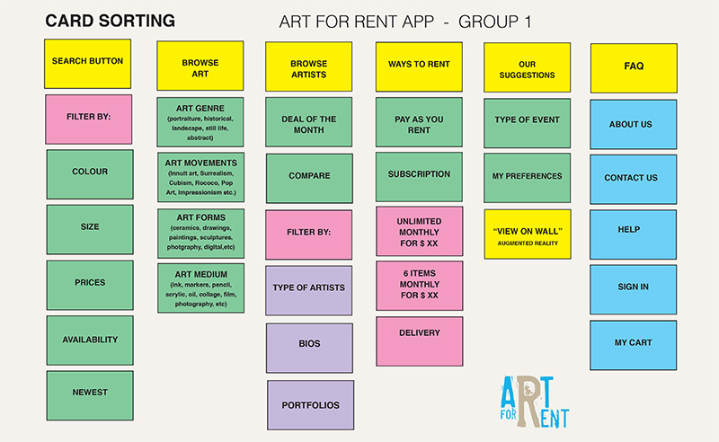
The team conducted two sessions of card sorting. It started with an open card sorting deciding what the final categories should be and how they should relate to each other. This one was followed by a closed card sorting which has resulted in changes in labeling and important adjustments in the information architecture of the app.
USER FLOWS ARTIST & RENTER
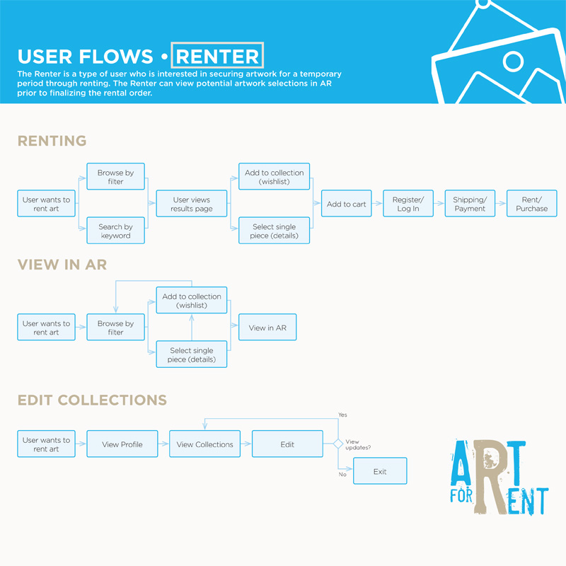
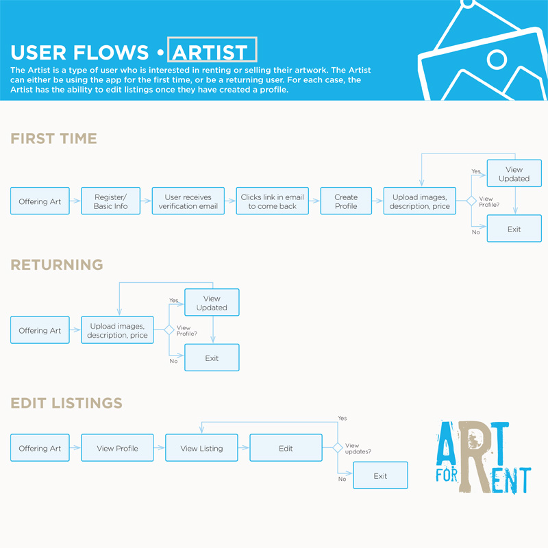
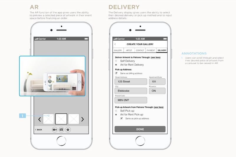
I created two User Flows. One for the artist and one for the renter, as the way each User category will access the app, is different. The Artist is the type of user who is interested in renting or selling their artwork. The Artist can either be using the app for the first time or be a returning user. For each case, the Artist has the ability to edit his/her listings, once they have created a profile. The Renter is a type of user who is interested in securing artwork for a temporary period of time through renting. The Renter can search the artwork exhibition by keywords or he/she can browse by using filters. The Renter can view potential artwork selections in AR (Augmented Reality) prior to finalizing the order.
Here I present:
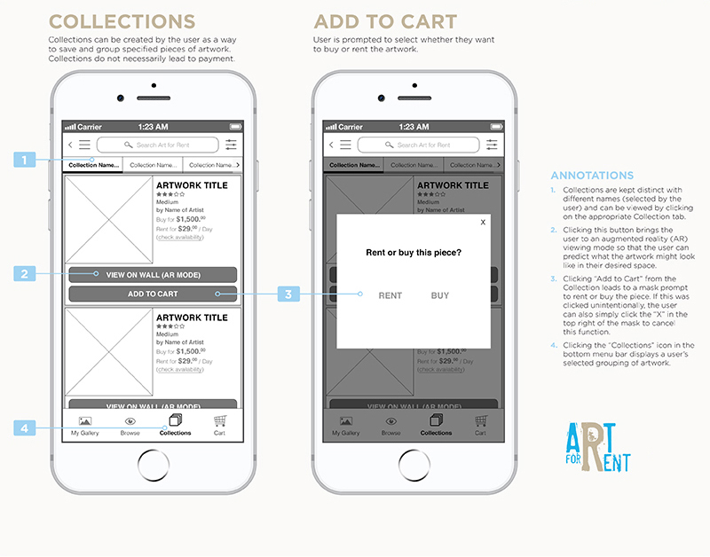
- The Renter User Flows, illustrating his experience when renting an artist’s work, when viewing the selected art in Augmented Reality, and when editing his Collections of artworks.
- The Artist User Flows, illustrating his experience when he registers for the first time in order to offer his artwork for rent when he returns to upload images to his portfolio and description and prices, and when editing his listings.
SITEMAP
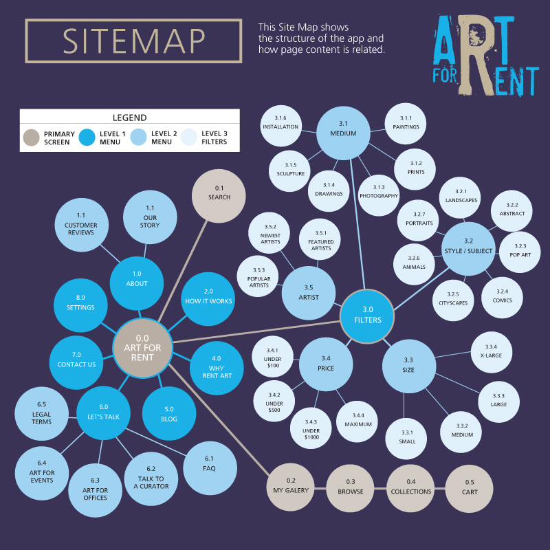
Mapping the flow of a mobile application is trickier than that of a traditional sitemap. Taking into consideration the card sorting results and the User Flows, I tackled this complex system by deciding that simplicity should be the priority when designing the Art for Rent User Interface. Therefore, before creating and presenting the Wireframes, given the complexity of this particular app, I approached this stage by using the traditional sitemap way of displaying the hierarchy of content.
I wanted to make clear how the menu, the utility nav, and the search button are related to the primary screen, and how the Browse for Art evolves into multiple levels, all in strict corellation.
WIREFRAMES
My team and I designed 22 Wireframes.
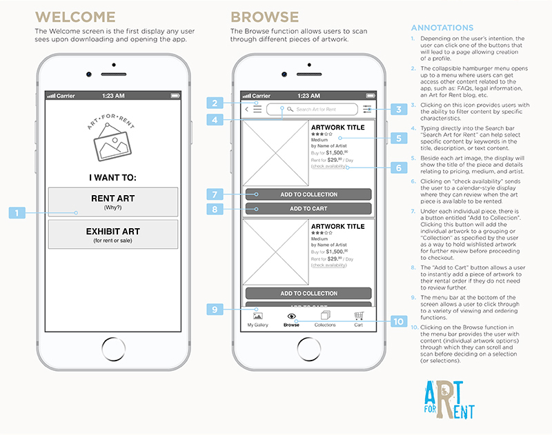
The first Wireframes deal with the Welcome Screen. This one is the first any user sees upon downloading and opening the app, where they have an option to chose between Renting Art (for patrons) or to Exhibit Art (for artists). The primary screen displays a collapsible hamburger menu, an icon that contains all the filters by specific characteristics at the top of the screen, next to the search button, and also the fix menubar at the bottom of the screen, containing Browse button, My Gallery, Collections, and Cart.
The Filters allow users to view the artwork that has desired characteristics as specified by the user. The collapsible hamburger Menu at the top of the screen provides the user with the ability to find information about the services offered by Art for Rent, contact information, settings, legal terms, and how it works.
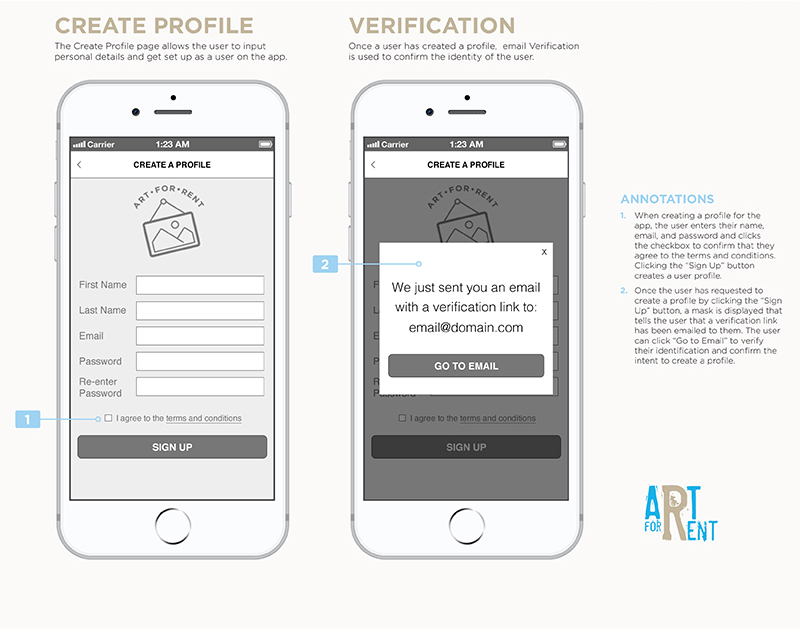
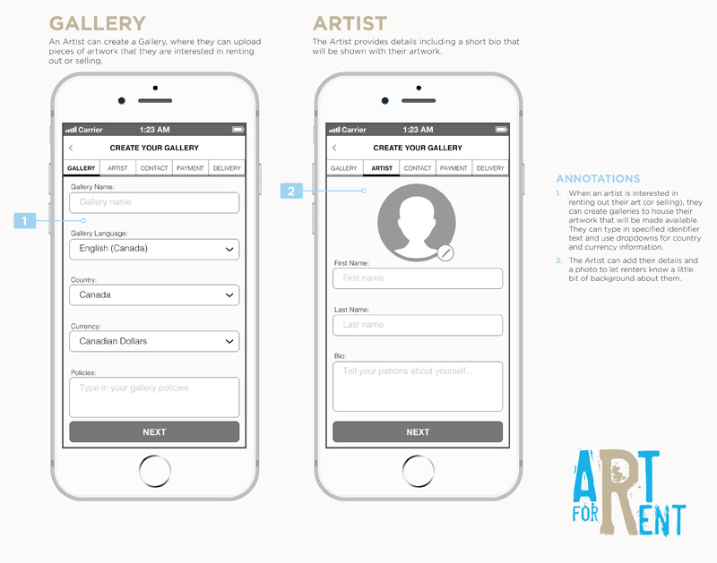
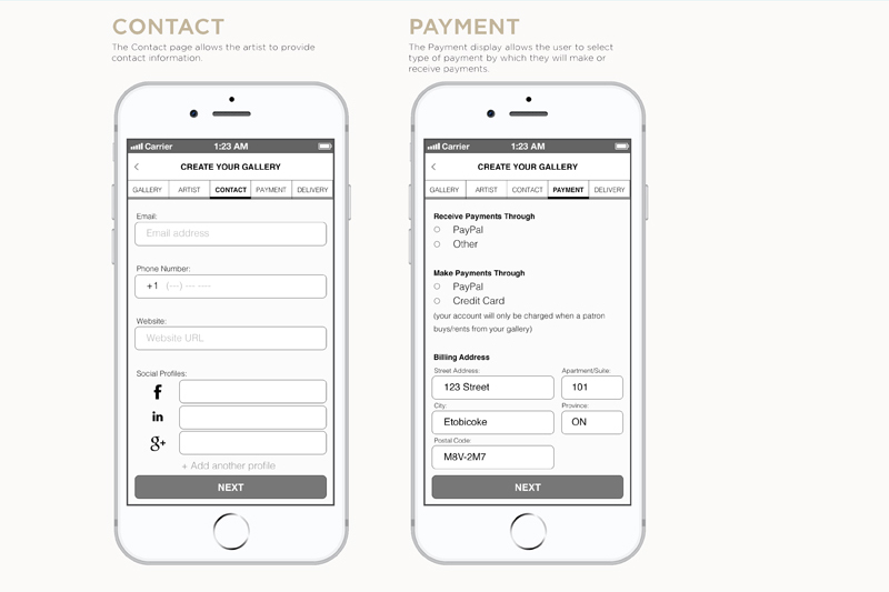
Other Wireframes created are for the Contact Screen (allows the Artist to provide contact information); the Payment Display (allows the user to select the type of payment); the Gallery (where an artist can upload pieces of artwork that they are interested in renting and/or selling); the Artist Page (where the artist provide details, including a short bio that will be shown with their artwork); the Sign In and Sign Up displays (are a prompt to the user to confirm their personal details, including payment details); the Check Out display (where the user can edit the delivery, shipping, and other details); the Cart display (which acts as a way to collect desired artwork with the intention of finalizing an order and proceeding with payment); the Add to Cart display (where the user is prompted the select the rental period and the calendar shows the availability of the art as well.
